- Overview
- Tile Button
- Getting Started
- Creating the TileButton Component
- Using the New TileButton Component
- Conclusion
Overview
I was tasked to build a new dashboard in Sitecore. We chose to build the dashboard using SPEAK v2. This was primarily to maintain a consistent look and feel with the rest of Sitecore. For the most part, I was able to build the dashboard using existing SPEAK v2 components. There was one component that I needed to build custom. I figured I would share how I built the component in case others need to do something similar.
Tile Button
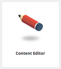
The component that I needed to build looks like a tile. It has an image, title, and overlay. Clicking on the tile takes the user to a configurable link target. The design of the component is as follows.
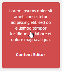
In the above example, the mouse pointer indicates a mouse-over where the tile displays the overlay text. The other tile in the design is in its steady state.
Getting Started
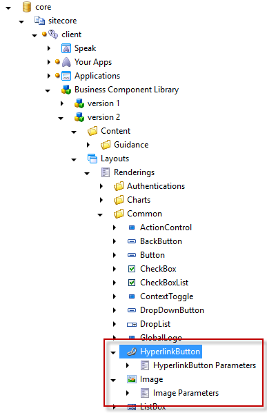
I found the easiest way to get started building a custom SPEAK v2 component was to copy an existing component and modify it. In a prior blog post, Sitecore SPEAK Components Guidance, I talked about how Sitecore provides examples for existing SPEAK components. We can use the Sitecore SPEAK Components Guidance to find similar components we want to base our new component on.
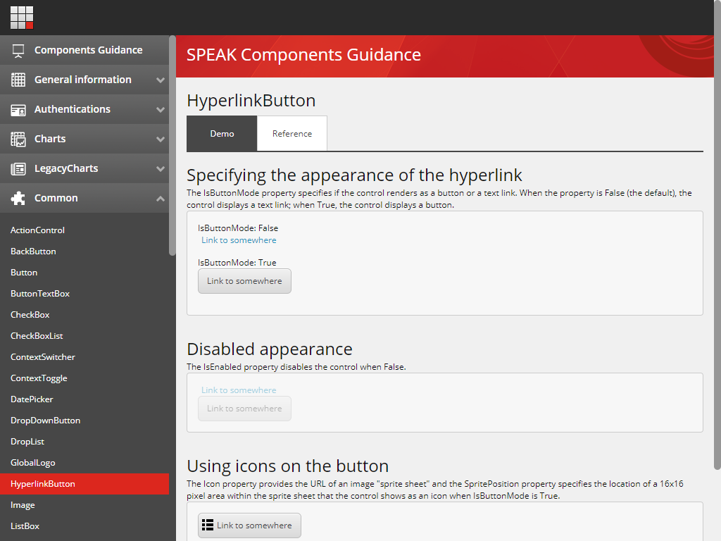
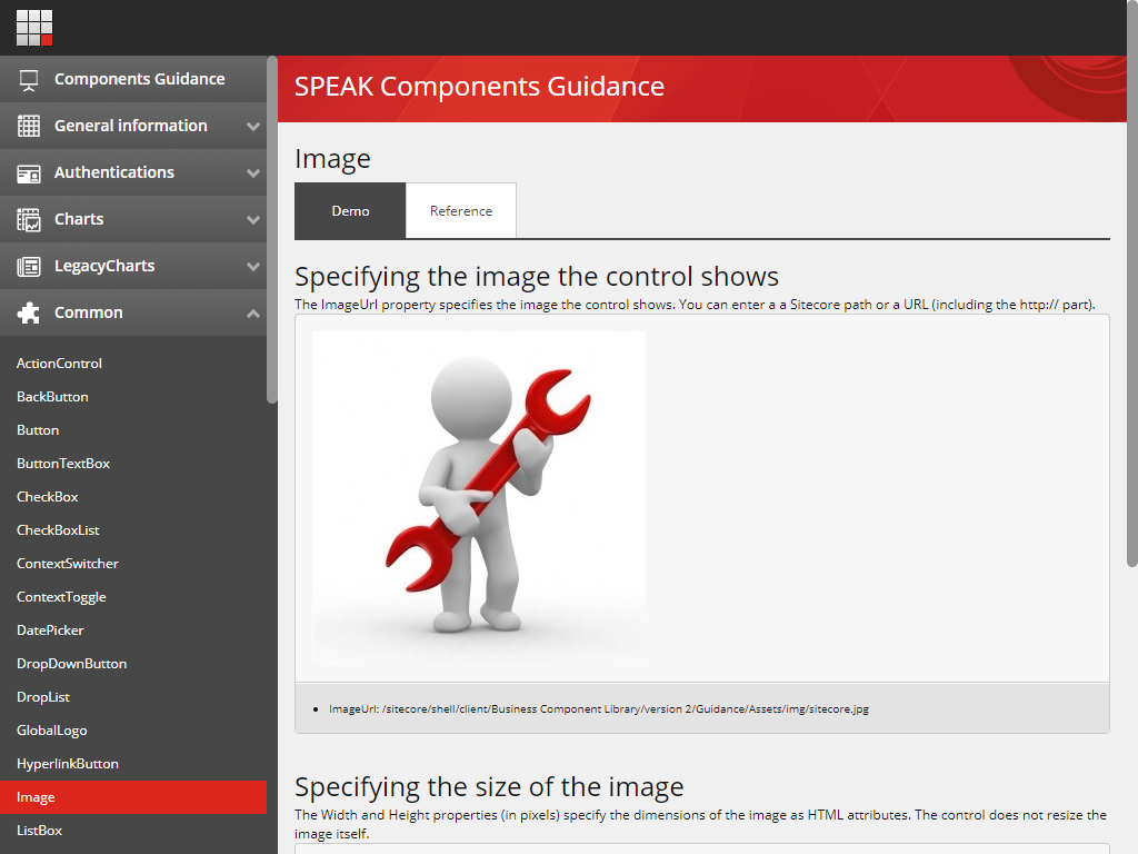
The existing HyperlinkButton and Image components make up what we want to achieve with the Tile Button.
http://[domain]/sitecore/client/Business%20Component%20Library/version%202/Content/Guidance/Dashboard
Using SitecoreRocks we can find the Renderings that make up the HyperlinkButton and Image. The renderings for both of these components are located in the Core database under: /sitecore/client/Business Component Library/version 2/Layouts/Renderings/Common
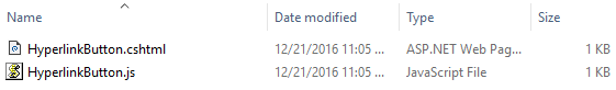
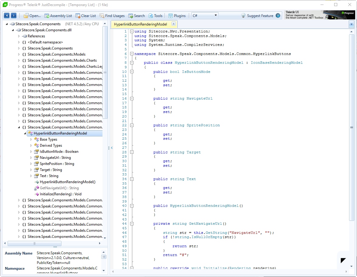
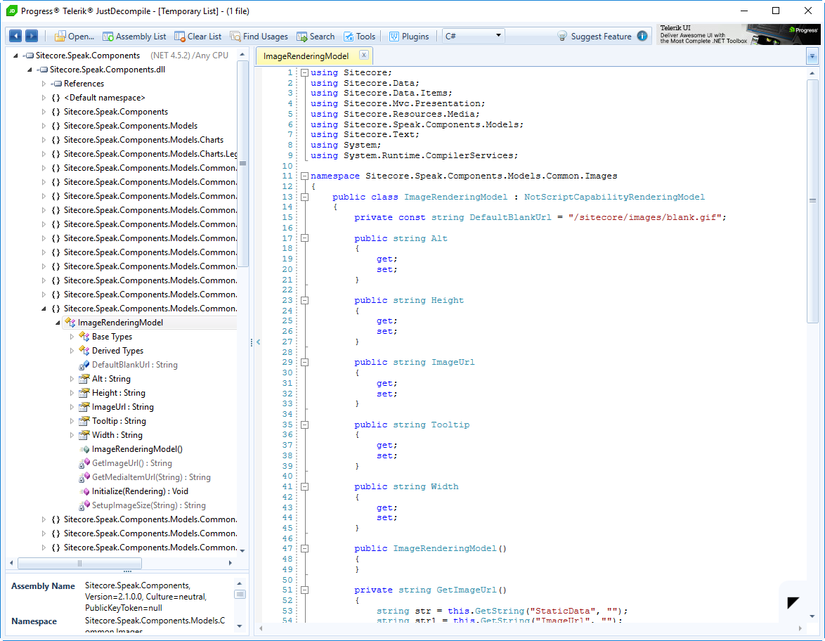
From this, we find that the associated .cshtml files and the other files related to the component. All files related to the component are in the same folder as the .cshtml file. We can also determine the model based on the type name. Using your favorite reflection tool, we can take a look at the definition of the model.
HyperlinkButton
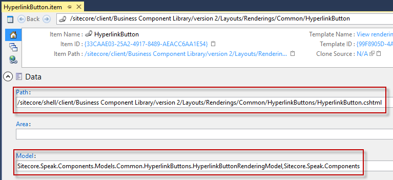
Path: /sitecore/shell/client/Business Component Library/version 2/Layouts/Renderings/Common/HyperlinkButtons/HyperlinkButton.cshtml
Model: Sitecore.Speak.Components.Models.Common.HyperlinkButtons.HyperlinkButtonRenderingModel,Sitecore.Speak.Components
Image
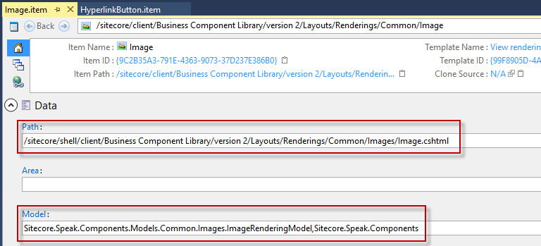
Path: /sitecore/shell/client/Business Component Library/version 2/Layouts/Renderings/Common/Images/Image.cshtml
Model: Sitecore.Speak.Components.Models.Common.Images.ImageRenderingModel,Sitecore.Speak.Components
Creating the TileButton Component
Now that we have the information from the existing HyperlinkButton and Image, we can use this information to build out our new TileButton.
Files
First, let’s build out the associated .cshtml, .js, .css, and .cs files. A .css example can be taken from another component (the HyperlinkButton and Image don’t have an associated .css file.) All the files we will create will live in the same location and have the same file name. The only difference between the naming is the file extension with the exception of the .cs file. Typically the files would be placed under sitecore/shell/client/Your Apps/[application name]/Layouts/Renderings/
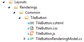
The following files and their content were created for the TileButton component.
TileButton.cshtml
@model TileButtonRenderingModel
@{
    Model.Class.Append("sc-tilebutton");

    Model.DataBind
      .IsVisible()
      .Bind("attr", "{ href: NavigateUrl}");
}

<a @Model.HtmlAttributes target="@Model.Target" href="@Model.NavigateUrl" style="display:none;">
    <div class="overlay sc-text large">@Model.OverlayText</div>
    <img data-bind="attr: { src: ImageUrl, alt: Alt, width: ImageWidth() ? ImageWidth : null, height: ImageHeight() ? ImageHeight : null, title: Tooltip()}"
            src="@Model.ImageUrl" alt="@Model.Alt" width="@Model.ImageWidth" height="@Model.ImageHeight" title="@Model.Tooltip"
            onload="this.parentNode.classList.toggle('show-default-image', this.getAttribute('src') === '/sitecore/images/blank.gif')" />

    <div class="title sc-text large weight-700-bold" data-bind="text: Text">@Model.Text</div>
</a>
TileButton.js
(function (speak) {
  speak.component({
    name: "TileButton",
    initialized: function () {
        $(this.el).on("click", this, this.handler);
        $(this.el).show();
    },
    handler: function (e) {
      var control = e.data;
      if (e && !control.IsEnabled) {
        e.preventDefault();
      }

      var invocation = control.Click;
      if (!control.IsEnabled) {
        return;
      }

      if (control.Click) {
        var i = invocation.indexOf(":");
        if (i <= 0) {
          throw "Invocation is malformed (missing 'handler:')";
        }

        speak.module("pipelines").get("Invoke").execute({
          control: control,
          app: control.app,
          handler: invocation.substr(0, i),
          target: invocation.substr(i + 1)
        });

        e.preventDefault();
      }

      control.trigger("click", control.el);
    }
  });
})(Sitecore.Speak);
TileButton.css
.sc-tilebutton,
.sc-tilebutton .overlay {
    border-radius: 5px;
    width: 200px;
    height: 230px;
}


.sc-tilebutton {
    background-color: #FFFFFF;
    border-color: #E4E4E4;
    border-style: solid;
    border-width: 1px;
    margin-left: auto;
    margin-right: auto;
    margin-top: 20px;
    margin-bottom: 20px;
    display: block;
    text-align: center;
    position: relative;
}

    .sc-tilebutton:hover {
        text-decoration: none;
    }

    .sc-tilebutton img {
        display: block;
        margin-top: 30px;
        margin-left: auto;
        margin-right: auto;
    }

    .sc-tilebutton .sc-text {
        color:#000000;
        padding-top:20px;
    }

    .sc-tilebutton .overlay {
        display: block;
        opacity: 0;
        position: absolute;
        bottom: 0px;
        left: 0px;
        right: 0px;
        padding: 20px;
        color: #ffffff;
        background: #000000;
        text-decoration: none;
        text-align: center;
        -webkit-transition: opacity 500ms;
        -moz-transition: opacity 500ms;
        -o-transition: opacity 500ms;
        transition: opacity 500ms;
    }

    .sc-tilebutton:hover .overlay {
        background-color: #CB3839;
        opacity: 0.9;
    }

    .sc-tilebutton:hover .title {
        color: #ffffff;
        position: relative;
    }
TileButtonRenderingModel.cs
using Sitecore;
using Sitecore.Data.Items;
using Sitecore.Mvc.Presentation;
using Sitecore.Resources.Media;
using Sitecore.Speak.Components.Models;
using Sitecore.Text;

namespace Website.sitecore.shell.client.OneNorth.MarketingDashboard.Layouts.Renderings.Common.TileButton
{
    public class TileButtonRenderingModel : ComponentRenderingModel
    {
        private const string DefaultBlankUrl = "/sitecore/images/blank.gif";

        public string Alt { get; set; }

        public string ImageUrl { get; set; }

        public string ImageHeight { get; set; }

        public string ImageWidth { get; set; }

        public string Tooltip { get; set; }

        public string NavigateUrl { get; set; }

        public string Target { get; set; }

        public string Text { get; set; }

        public string OverlayText { get; set; }

        public override void Initialize(Rendering rendering)
        {
            base.Initialize(rendering);
            Alt = GetString("Alt", "");
            ImageHeight = GetString("ImageHeight", "");
            ImageWidth = GetString("ImageWidth", "");
            Tooltip = GetString("Tooltip", "");
            ImageUrl = GetImageUrl();
            Properties["ImageUrl"] = ImageUrl;

            Target = GetString("Target", "");
            Text = GetString("Text", "");
            OverlayText = GetString("OverlayText", "");
            NavigateUrl = GetNavigateUrl();
            Properties["NavigateUrl"] = NavigateUrl;
            Properties["Click"] = GetString("Click", "");
        }

        private string GetImageUrl()
        {
            var staticData = GetString("StaticData", "");
            var imageUrl = GetString("ImageUrl", "");
            var strArray = new string[2]
            {
                staticData,
                imageUrl
            };
            foreach (string path in strArray)
            {
                var mediaItemUrl = GetMediaItemUrl(path);
                if (!string.IsNullOrEmpty(mediaItemUrl))
                    return mediaItemUrl;
            }
            if (string.IsNullOrEmpty(imageUrl))
                return "/sitecore/images/blank.gif";
            return imageUrl;
        }

        private string GetMediaItemUrl(string path)
        {
            if (string.IsNullOrEmpty(path))
                return string.Empty;
            var item = ClientHost.Items.GetItem(path);
            if (item == null || !item.Paths.IsMediaItem)
                return string.Empty;
            var empty = MediaUrlOptions.Empty;
            empty.Database = ClientHost.Databases.Database;
            string mediaUrl = MediaManager.GetMediaUrl(item, empty);
            if (string.IsNullOrEmpty(mediaUrl))
                return string.Empty;
            return SetupImageSize(mediaUrl);
        }

        private string SetupImageSize(string url)
        {
            var urlString = new UrlString(url);
            if (!string.IsNullOrEmpty(ImageHeight))
                urlString.Add("h", ImageHeight);
            if (!string.IsNullOrEmpty(ImageWidth))
                urlString.Add("w", ImageWidth);
            return urlString.GetUrl();
        }

        private string GetNavigateUrl()
        {
            var navigateUrl = GetString("NavigateUrl", "");
            if (!string.IsNullOrEmpty(navigateUrl))
                return navigateUrl;
            return "#";
        }
    }
}
Next, we need to register the .css file so it will be packaged with the rest of the .css files. We can create an App_Config/Include file.
App_Config/Include/TileButton.config
<configuration xmlns:patch="http://www.sitecore.net/xmlconfig/">
  <sitecore>
    <pipelines>
      <speak.client.resolveScript>
        <processor type="Sitecore.Resources.Pipelines.ResolveScript.Controls, Sitecore.Speak.Client">
          <sources hint="raw:AddSource">
            <source folder="sitecore/shell/client/Your Apps/[application name]/Layouts/Renderings" deep="true" category="components" pattern="*.js,*.css" />
          </sources>
        </processor>
      </speak.client.resolveScript>
    </pipelines>
  </sitecore>
</configuration>
Items
Now that we have created all of the files, we need to create the associated items in the Core database. We can follow the pattern of the items we saw for the HyperlinkButton and the Image.
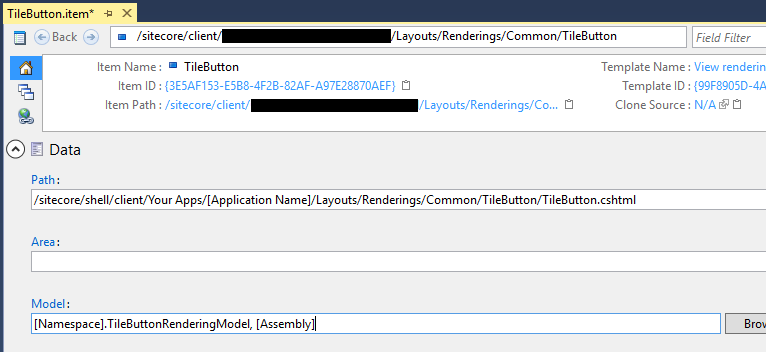
The TileButton supporting items should be placed under sitecore/client/Your Apps/[Application Name]/Layouts/Renderings/ in the Core database.
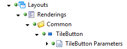
The TileButton item should be based on the View rendering template. The Path and Model should be updated with the appropriate values.
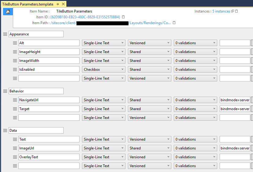
The TileButton Parameters item should be a template. The template should contain the fields used by the Tile Button.
Using the New TileButton Component
Now that the TileButton is created, it can be included in a Speak v2 layout. To include it in a Speak layout, right click then select Tasks / Design Layout on the Speak Page. From there, click Add Rendering. You can search for the TileButton by name. Once added, the properties of the TileButton can either be set directly or through a DataSource. This component follows the same pattern as any other component for usage.
Conclusion
I hope this walk-through, demonstrated how easy it is to create a new Speak v2 component using an existing component as an example.